The Ultimate Guide to Email Design: For Email Marketing Success in 2022
"Design is not just what it looks like and feels like. The design is how it works.”
-Steve Jobs.
The ultimate test of whether your email marketing is effective would be decided by the number of people who take the desired action. So people might be opening your email because they "look pretty," but that beautification is of no use if it's not eliciting action from them.
So, if you want to make your emails work, you have to learn email design (that goes beyond beautiful colors and fancy fonts!) and take advantage.
Email design can help increase conversions
With decreasing attention spans & increasing information, the brain is constantly making decisions on whether to engage with a content piece or not. The popularity of social media apps focused on visuals and videos (Instagram and Tik Tok), it's evident that visuals influence our brains massively.
If you catch the reader's attention multiple times via your emails, you will be able to convince them to buy from you finally, sign up for your webinar, or book a demo call… whatever is the action you desire from them.
Email design helps create a strong brand
Imagine if everyone was writing plain text emails with Arial font, 12px size, and black color. It would've been hard to recognize one brand from the other. Headspace would have looked very similar to Calm or any other meditation app.
But now, because of the distinct colors, whenever we see the orange color of Headspace, it makes us connect to the brand even if we don't see the Headspace name written there.
Email design is a great way to reinforce your branding in people's minds.
Email design is influenced by different components coming together to create a cohesive and pleasant-looking email that people want to read. Even if one component is out of place or badly designed, it will ruin the chances of conversion. Imagine a great layout, well-formatted copy but the email uses bright colors that hurt your eyes. That would make you mark the email as spam or unsubscribe instantly.
So here are 7 key components that complete email design:
Layout
The layout of an email is the placement and hierarchy of different elements of your email. The purpose of the layout is to help people consume information in bits and pieces without trying to assimilate everything at once.
Here are useful tips to keep in mind when deciding on your email layout:
Choose a layout that is mobile responsive. People check emails while waiting for cabs, in the coffee shops, or just before going to bed. So it's no surprise that more than 50% of emails are opened on mobile. The stats are only rising. So choose a layout from which you will be able to create a responsive design.
Create separation between different sections by using alternating colors, ample white space, horizontal lines or borders. This helps people skim through the content.
Choose a consistent alignment for your email. If you are keeping all your headings in center, then don't make one stand out by making it left or right-aligned. The same goes for content.
Use ample white space. White space is the blank area that you see between various elements in your email. It improves readability, gives more attention to your CTAs and thus improves conversion.
Know more about email layouts, pros & cons of different types of layouts & to figure out which layout to choose for which type of content, checkout our detailed post on email layouts here.
Call-to-action
CTAs (Call-to-actions) ask people to click on a link so that they can go to the next step in the journey which can be booking a demo, reading a blog or buying an item.
Images/Visuals
A picture is worth a thousand words, said anonymously. So it's worth it in an email when you have to say a lot more in a short time and small space. The case for images is pretty strong so let's get into quick tips to make use of images to enhance email design & improve conversions:
Color
Three important tips for coloring your emails:
Choose a color palette that your brand already uses to make emails look like natural extensions of your website. Your primary colors in your color palette should be fixed, while the secondary ones might change.
Font
There are thousands of fonts out there but that doesn't mean you have to use them all. Stick to two fonts: one for your headings and one for your main text. If you want to draw a separation between different sections, you can vary the weight and size of your font rather than choosing a totally different font.
Brand Identity
A brand's visual identity is most solidified by its logo. Make sure you include that in all your emails, preferably at the top. Other elements to show your brand identity can be the brand's catchphrase or slogan.
Here are some examples of brands owning their brand and showing it off with custom phrases at the bottom of emails:
Allbirds footer with catch phrase
Keep your email design consistent
A consistent design might sound like it will make all of your emails feel the same which might make things boring for the reader. But consistency should be in the design language, not in how your emails finally look. Meaning, you should use the same font, same brand colors and similar illustration styles. This will reinforce your brand in people's minds, creating a strong association with it. When they see your brand displayed somewhere else, they would be able to recognise it instantly. Think about it, don't you think of Nike whenever you see the swoosh sign in black or white colors?
Craft compelling copy
It may seem like copy is not part of design, but since copy is the one that's going to convey your message, it is the most important factor to keep in mind while designing your emails. A good looking email with no focus on the copy is as useless as a velvety wrapping paper around an empty box.
Keep your copy short. Make your headlines punchy. The copy of your CTAs should be clear and action-oriented. Use bullets, listicles and headlines to make it easy to skim through.
Designing good looking emails that are not just blobs of text someone typed in a document is a resource and time intensive task. It requires you to learn coding and designing. The easy way around is to use email templates that render responsive emails.
SendX gives you 35+ free email templates. Why you should check out these templates:
These are responsive, so you don't have to worry about fixing the alignment for different devices.
You can find a template for a variety of use cases, ranging from abandoned carts to welcome emails. Along with the templates, SendX also gives you half a million free stock photos that you can include in your emails. No more time wasted trying to find free visuals for attractive emails.
All templates can be customized to suit your brand identity, colors, text, etc using the drag-and-drop email editor.
When designing & sending emails, the most frustrating worry is: You spend hours designing an email only to find out that it doesn't look the way you wanted in your subscribers' inboxes. Since your subscribers might be using different email providers, such as Gmail, Yahoo or Outlook, emails can look different for various subscribers.
Major issues are: images get blocked, custom fonts won't render, background image goes missing, or layout gets deformend. That's why it's important to test your emails before you send them.
Fortunately, there are tools to help you see the preview for different inbox providers even before you hit 'send'. Before you start looking for those, check whether your email service provider already has something in-built. If not, check some of the tools listed here: 11 Best Email Preview Tools for Better Engagement
What should you do before you start designing your promotional or informational email newsletters? You should look for inspiration from the best brands out there who've mastered the art of designing high-converting emails. We've collected 10 delightful email design examples here, with takeaways from each one.
1. Headspace
Takeaways:
Mix of one column and two column layout. The heading and CTA are in one column, the middle section that explains sessions are in two column format
Separation between the header part (logo, headline and image) from the main copy part with different colors (peach and white). To learn more about how to optimize your email header for better conversion, checkout our detailed guide: 7 Practical Tips to Design Your Email Headers.
Ample white space between sections make it look neat.
CTA color is the same as brand color and because it contrasts well with white background, it draws attention.
3. Clam
Takeaways:
Ample white space (FYI, white space doesn't have to be white in color, it can be any space that's blank) makes the information easy to digest.
Use of icons to show what the section is all about, visually.
Variation in font size and capitalization.
The offer section, which drives conversion and is the most important section, is placed above the fold.
5. Feedly
Takeaways:
Text style email with a bit of subtle design
Use of emojis make it casual and not uptight
Customized illustration at top makes it more human
Highlighted text to draw attention to the important information.
7. Reformation
Takeaways:
Variation in image size makes it not-so-monotonous.
Text is intertwined with the images making it flow into a story.
Simple white background keeps the images with dresses as highlights.
Mix of one column, two column and three column structure.
9. Atom
Takeaways:
Logo font is the same but color is changed to suit the theme of the newsletter.
Use of serif font for the headline and sans-serif for the text section.
Gradient style background with neon colors catches the eye.
CTAs are subtle but visible due to ample white space around them and distinct borders.
Wrap Up
Email design doesn't have to be a mammoth, one-time activity where you exhaust all your creativity. You can build on design consistently. Start with putting your company's logo at the top of emails. Then build a custom signature or sign-off. Then you can move on to more complex things. To help you build designs faster, email templates & drag-and-drop editors are available. Try out a few before deciding what suits your business. SendX offers a 14-day free trial to test out all the features related to email creation, designing, sending and analyzing metrics.
You will find what key features to focus on when & which best practices to keep in mind when creating email design. There are tips on specifically designing an email newsletter and 10 examples of great email design from top brands.
If you manage, monetize or send out emails to any type of audience, this guide is meant for you.
The Ultimate Guide to Email Design: For Email Marketing Success in 2024
The world is an unfair place. You might have noticed a brand you like or your competitor whose offer is not so good, but their emails still drive consistent revenue.
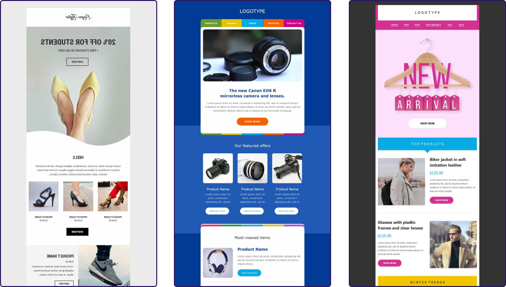
They might have done many things right, like segmentation, email sending frequency, or the copy. But the biggest unfair advantage they might have over your brand is email design. We call it the biggest advantage because humans ’see’ before they start reading anything, forming the first impression.
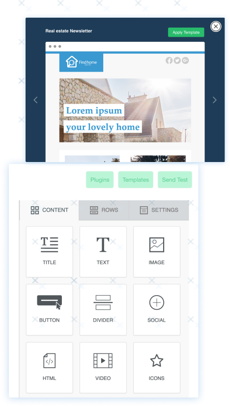
If you are reading this, you've started thinking about improving your email design, and we are glad that you came to the right place. In this post, we've explained how you can convert ordinary-looking emails to high-performing marketing tools with the help of design.
Dowload a free PDF version of this content!
Email design is a plan to create and arrange the elements of an email so that it becomes visually pleasing and easy to navigate, thus influencing the recipients to take action.
It should not be confused with email layout. Email layout is only concerned with the flow of information. It influences the reader on what they should check out first and how they will go through the information till the end.
For example, the choice of font size, images, the length of copy, and the type of button are email design elements. But whether the information is structured in a single column or two columns comes under email layout. So once you've decided on your layout, it becomes easy to design the elements in your email.