In 2020, people spent an average of 11.8 seconds reading a marketing email, and in 2021 it declined to 10 seconds.
Unfortunately, this number will keep decreasing in the coming years. Why?
The reason is simple; too much content and too little time for people to read it all.
It means that you’ll have to level up your email game to cut through the noise and keep your readers hooked to your email.
Hence, it’s essential to pay attention to each detail, including your email headers. It’s the very first thing your readers see and decide whether to continue reading your email or move on to the next one.
We’ll learn the basics of the email header and the do’s and don’ts to design an attractive email header through this article.
Let’s refresh our basics first.
An email header consists of:
Here, we’ll talk about the HTML header visible to your readers inside the email. It’s the top section of your email, followed by a body and footer.
Source: Really Good Emails
An email header is a small but significant section of your email. If used wisely, it can set the right tone compelling the reader to keep scrolling and hit that CTA button.
It's also an effective marketing strategy that creates brand awareness among your audience.
To design striking email headers, keep the following simple yet effective do’s and don’ts in mind.
1. A Header That Relates To Brand
The header reinforces who the sender is and builds trust. So, ensure to maintain consistency of the brand's visual identity among the audience.
If a website visitor subscribes to your email communication, then the email should instantly remind them of you.
Example: Grammarly
Source: Grammarly’s Website
Source: Really Good Emails
Takeaways:
2. Images That Catch the Eye
Adding a quality image in your header breaks the monotony and nudges the reader to scroll to know more.
Example: Disney
Source: Really Good Emails
Takeaways:
3. A Clean & Simple Header
Since the header is the first thing a reader sees in an email, it can be tempting to put in all kinds of information there. But it can be distracting and may route the reader to another email or keep them from reaching the CTA.
So, to make the most of this limited space, use a minimalist approach.
Example: Pret A Manger
Source: Really Good Emails
Takeaways:
4. Put Your Mascot to Action
If you have a brand mascot, use it in your email headers to strengthen your brand identity.
It’s a fun way to personify your brand and convey its message effectively.
Example: Duolingo
Duolingo's mascot is Duo, an owl. You can often spot Duo in their header, resonating the email’s sentiment.
Source: Really Good Emails
Takeaways:
5. Incentivize the Reader
Nothing is better than some rewards to hook the reader to your email. And headers are a great place to give the reader a glimpse of what’s in it for them.
Example: The North Face
Source: Really Good Emails
Source: Really Good Emails
Takeaways:
6. Animate the Header
Movement in gifs or animation captures the attention immediately and makes the email interesting.
It’s also a great way to show the value of your product or a feature of it instead of writing long sentences.
Example: Netflix & Burberry
Source: Really Good Emails
Source: Really Good Emails
Takeaways:
Source: Really Good Emails
7. Customize your Headers
Maintaining consistency in the header doesn’t mean it has to be boring. You can keep multiple versions of the header without losing the brand identity.
Example: Allbirds
Version 1
Version 2
Version 3
Takeaways:
1. Don’t Overuse the Navigation
Don’t overwhelm the reader with too many options in the header. Keep the menu concise so that the reader can quickly get what he wants.
A clean header looks better even when seen on a smaller device like a mobile.
Source: Really Good Emails
2. Don’t Design a Big Header
The readers use mobile, tablets, and desktops for reading emails. Design your email header so that it looks appealing on any device.
Ensure that the email header size is between 650-700 px for the same viewing experience.
3. Don’t Add Unclear Content
Don’t save your good ideas for the email body only. Good copywriting is also necessary for the email headers to engage the readers.
Statements with no apparent value can drive the reader away before they even scroll down to the main content.
An effective email is the one that instantly engrosses the reader and makes them take the needed action. And you can’t expect the reader to give the email body a try unless the header appeals to them.
For better conversions, start from where the first interaction in the emails begins with the readers.
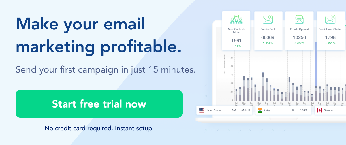
SendX provides 20+ free email templates that have been designed by professionals and have proven to be high-converting. In these templates, you get different email headers to hook people as soon as they open their emails.
Your email header is critical for a successful marketing campaign. It sets the tone for your email and hence can’t be overlooked.
Now use these best practices to design email headers that impress your readers.